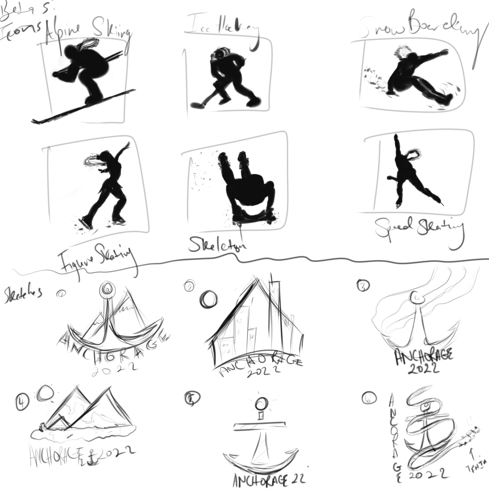
Winter Olympics Anchorage Concept
The logo was inspired by the name Anchorage itself, which was known as an Anchor town. Then the top of the anchor shows some of the views which are snow-covered

Tickets designed by drawing reference to the wonderous night sky of Anchorage, then the snowy mountainous region of Alaska.
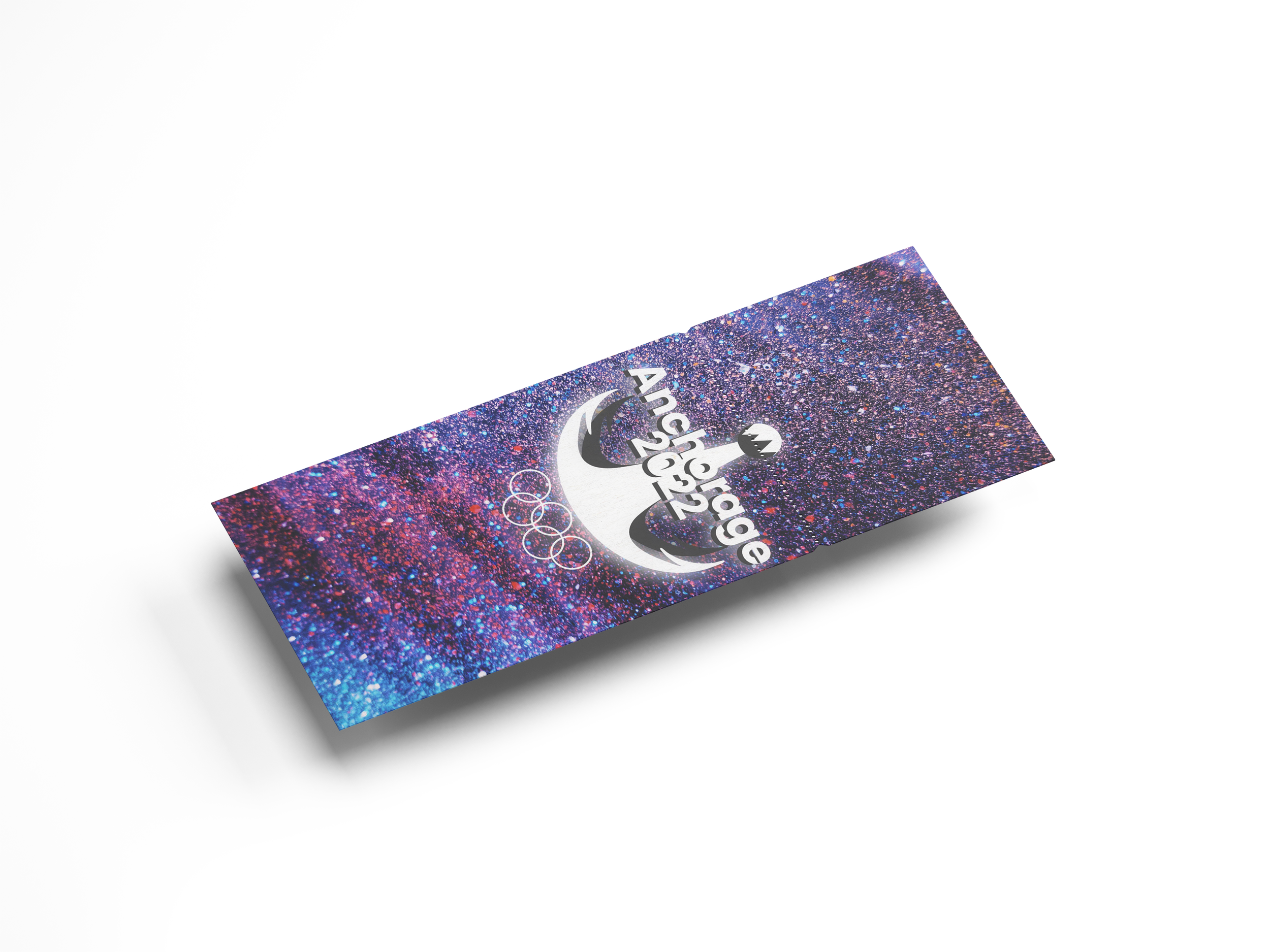
Back of ticket uses empty space to draw attention to the logo along with showing off the sparkling texture that is meant to reference the night sky.

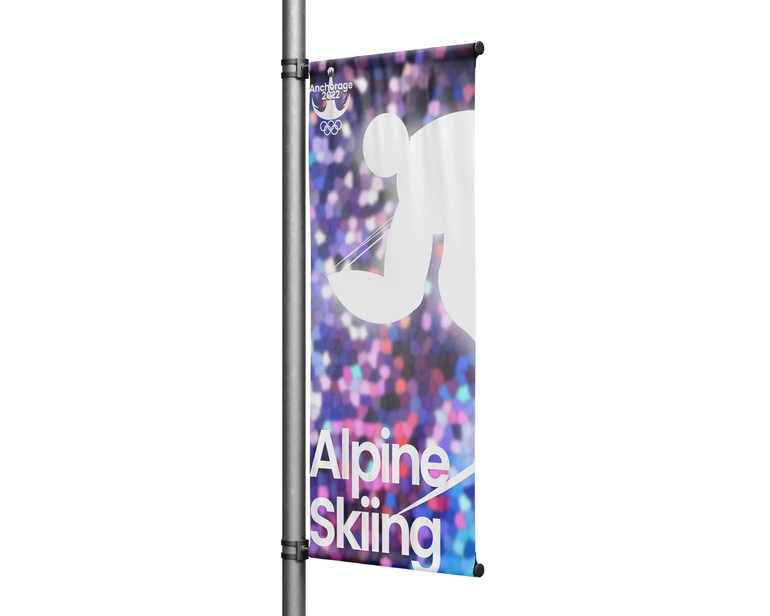


Exclusive Merchandise for purchase during the event, this brings in the white of logo on the sleeves while showing the logo on the chest.


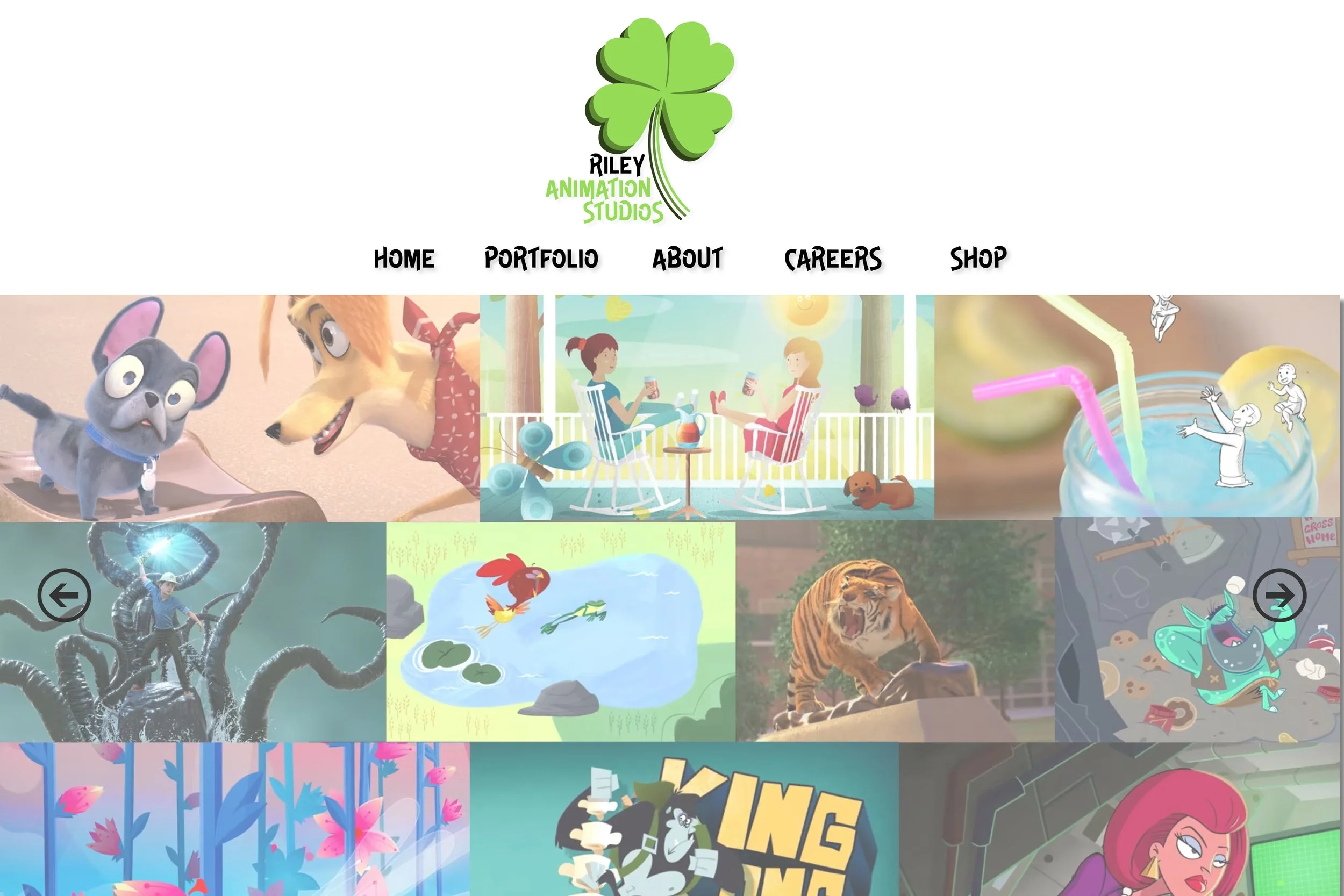
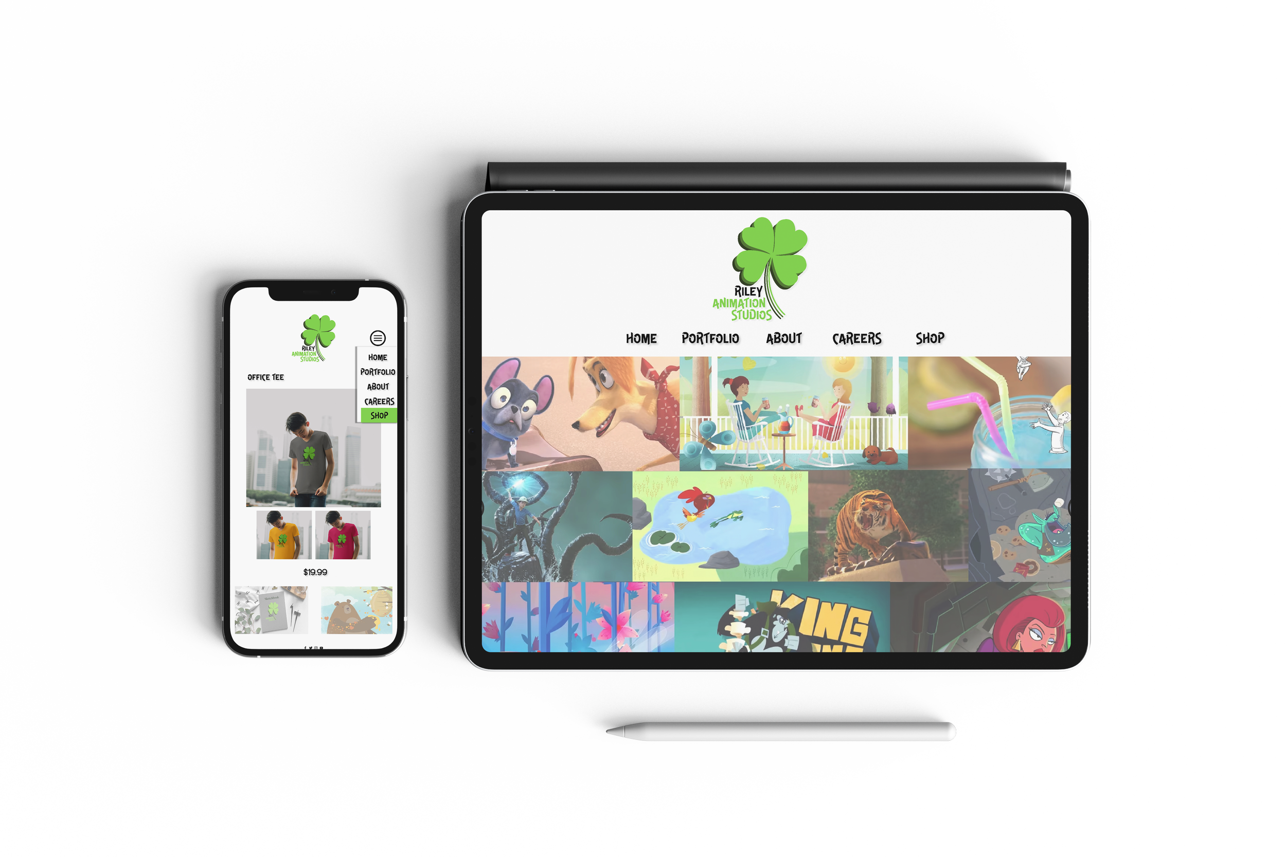
Riley Animation Studio
New Logo - Goal is to maintain a portrait layout and easy use for social media and mobile platforms.

Old Logo - Landscape layout

Tablet/Website Interface

Merchandise bag